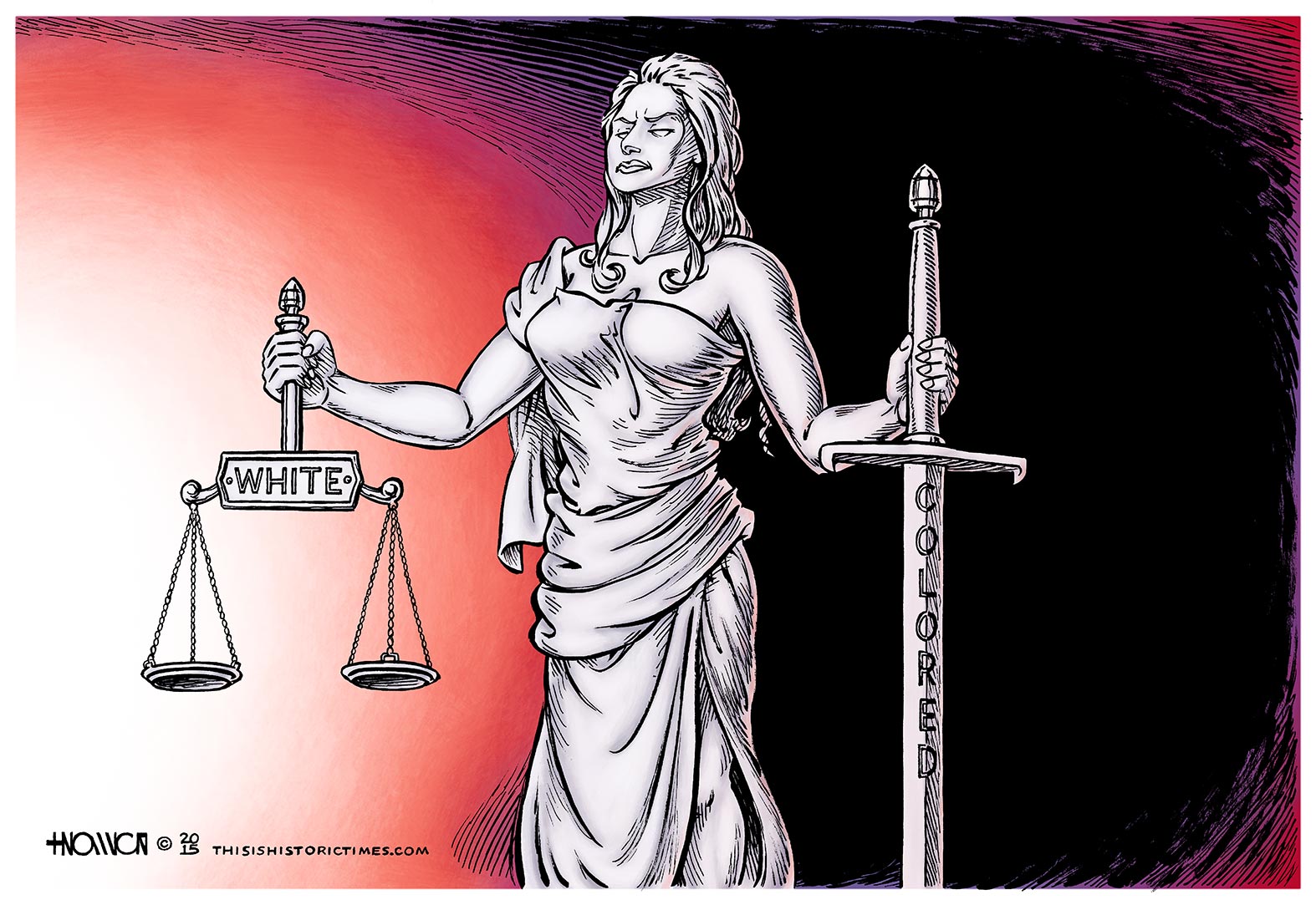
Separate but Equal Justice Under Law

Often, when I draw cartoons about race issues, I worry that audiences might get the wrong message from the image–even as far as the opposite of its intended meaning.
I’ve found the most efficient way to call out various social institutions and political philosophies for pervasive, endemic, or even inherent racism, is to turn the symbolic language of racism against both the primary target of the cartoon, and against racist ideology itself, thus depriving each of their power.
…at least, that’s how it’s supposed to work, in theory. I don’t know if I’ve ever fully lived up to that ideal scenario, in practice. I suppose I have gotten pretty good milage out of using the Klan to mock the racism of the Tax Evasion Allies Party, or the Roberts Court’s gutting of the Voting Rights Act (not to mention one of its specific members), or the dog-whistle politics of the GOP. But I, like many cartoonists since at least the ’80s, was probably assisted quite a bit, in those cases, by the general, moonshine-swilling, backwoods buffoonishness with which the Klan has increasingly come to be associated, over time.
Thankfully, they’ve weakened from the threatening terrorist organization they once were into basically the Ku Klux Klowns.
Cartoons like this one are a bit dicier. While its reading is pretty unambiguous, calling neo-Confederate Cliven Bundy, and ex-Clippers owner Donald Sterling racists by showing them literally building a racist symbol the way children might put together a snowman, the symbol itself is generally so poisoned that it may not be possible to use it even sarcastically, to ridicule racism, or as a metaphor for racism, without it still being way too offensive. Older cartoonists have run afoul of this problem in recent years, and while their uses of the symbol generally haven’t been as nuanced as my own, linked example, that’s not to imply that mine was better-enough, or that anyone’s could be. I don’t really know, and the cartoon in question didn’t generate the discussion that might have answered that question, as I’d hoped it would.
The above cartoon is probably somewhere in between. I can see it being much easier to A Good Bad Cartoon it than I’m typically comfortable with, perhaps reading it as saying, “White justice carefully weighs facts, while black justice immediately resorts to violence.” That would of course be the opposite of what I intend, which is to say that the entire justice system in the U.S., and not just the police, is still racially-biased against darker-skinned minorities; almost as if one of the things “Justice” measures, when determining the guilt or innocence of the accused, is how white that person is. This racism is most prominently revealed any time a white cop (or a human marshmallow pretending to be a cop) shoots a young, unarmed black man (or 12-year-old) dead, and is subsequently acquitted; but it occurs on a much larger scale with rates of incarceration, or punishment for minor (such as drug-related) offenses, neither of which gets nearly as much attention, but both of which are just as serious indicators of a major problem.
In my cartoon, then, the scales represent the due process which usually better-favors whites, while you could say the sword represents extrajudicial police force, or capital punishment, which disproportionately fall upon blacks.
Unfortunately, it’s not quite as clear or effective as the last time I used the imagery of Segregation to attack modern, Segregation-like policies that benefit one class, while simultaneously depriving another of their Civil Rights–perhaps because I was using Segregation itself as a metaphor for something else, as opposed to addressing its vestiges, which continue to grow in our legal system like difficult-to-eradicate weeds (see, THAT probably would’ve been a much better cartoon than the one above! I need to try writing one of these articles first, and drawing the cartoon second, sometime…).
The artistically-inclined among you might also be bothered by the physical composition of the image, over which I struggled, and still failed to adequately resolve. In the past, I’ve dealt with the problem of isolated figures or objects with asymmetrical silhouettes, making it difficult to fit them into a balanced frame all by themselves, by putting them on a Dutch angle. It seems that I forgot that technique while working on this, however. A bunch of my cartoons have had subtle issues with visual balance, lately, and it’s something I’ve resolved to work harder on, though I suppose it’s thematically a somewhat appropriate mistake, in the above case.


Leave a Response