Short Leash

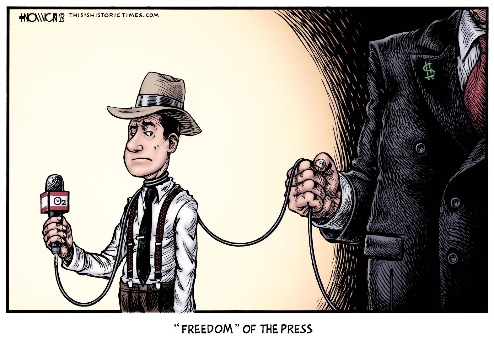
It was reported last week that Amazon.com founder Jeff Bezos was joining other ridiculously wealthy people with far too much individual control over large segments of the news media by acquiring the Washington Post, and all its associated properties.
While Bezos does bear a striking resemblance to Kevin Spacey as Lex Luthor, I don’t find him too particularly threatening. He seems like a really friendly guy (though I guess looks can be deceiving…).
However, I do find the trend of all the world’s major media outlets falling into the hands of a privileged few very disturbing. The Gilded Age already taught us how that usually turns out, and I’d rather if we didn’t have to have another such lesson!
A few other cartoonists have commented on this, but I found them to be pretty underwhelming, either because they made the story too much about Bezos himself, or because they took a good play on words and then ruined it by sticking two generic people in to explain the joke to the reader.
The latter made it especially important, to me, for my own cartoon on the subject to communicate the main idea with visuals, and as few words as possible. I hit on the “leash/choke chain” idea almost immediately, although I initially was more literal about it, and had the reporter sitting at a typewriter. When my sketch abandoned the typewriter to give the reporter a microphone instead, I noticed the similarities between the reporter’s hand gripping the mike, and the “big money” character’s hand gripping the leash, which was when I realized I could combine the mike cord and the leash into a single object by wrapping the cord around the reporter’s neck.
There is one symbol in the cartoon which may confuse readers, though hopefully not to the point of immediate distraction. Since news microphones are traditionally depicted with plastic hoods labeled with the name or logo of the reporter’s company or organization, I knew I needed to have some kind of label on the microphone–leaving it blank looked too weird, and anyway, I figured it’d be a good, built-in opportunity for an extra bit of symbolism.
Labeling it with the Washington Post’s logo didn’t seem broad enough, but simply labeling it “news” felt too broad. After awhile, I thought the term “airtime” might fit together nicely with the imagery, but didn’t think it would be legible if I just wrote it out, so I instead decided to express it by writing O2 (oxygen, or air), and putting the hands of a clock inside the O (time). A friend of mine suggested I set the clock to a standard TV newstime, and I went with 11, since 6 would just look like a straight line in the middle of the O.
No one’s likely to pick up on it without the above explanation, but you don’t really need it to understand the cartoon. In retrospect, I kind of wish I’d labeled the mike “ON AIR,” but by the time I had that idea, it would’ve been too hard to change the physical artwork, and I’m still not certain it would have been better.
What do you think? Let me know in the comments! Also, as noted above, if you liked the cartoon, please send me a couple bucks!


One Response to “Short Leash”
This is excellent. But I think one of the good things about the Internet is that now you don’t have to rely on MSM for information. You can read a host of online news sites that are free from corporate control. They may be less reliable at times, but they are definitely more free than MSM.
Leave a Response