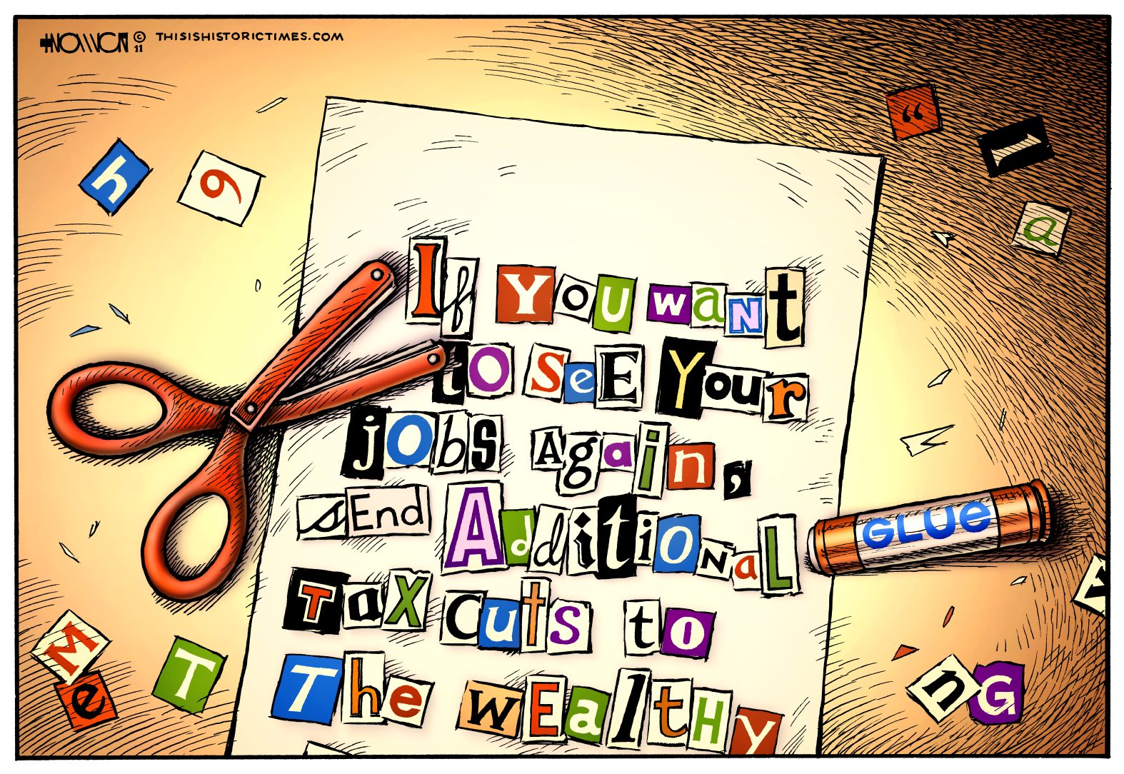
Tax Cut & Paste

I copied the basic idea and design for this cartoon from a different one I started earlier this year, or perhaps even late last year, but which I never finished. It works better in this case, because the earlier topic fell out of relevance relatively quickly, whereas this one should stay meaningful into the indefinite future.
Like this piece, this cartoon compares the “job creators” argument made by Conservative candidates and pundits to activities commonly associated with organized crime. Initially, I’d included a GOP symbol in the letterhead, but I realized it worked just as well without it, and that way could just as easily apply to the Democrats as well as the Republicans. Or to rich, corporate tools in general, really.
Tags: Economy, glue stick, hostage, jobs, ransom, ransom note, safety scissors, tax cuts, tax cuts for the rich, taxes, wealthy
This entry was posted
on Friday, December 9th, 2011 at 10:00 am and is filed under Cartoons & Commentary.
You can follow any responses to this entry through the RSS 2.0 feed.
You can leave a response, or trackback from your own site.


5 Responses to “Tax Cut & Paste”
Safety scissors? Dude, that’s cold!
>> this cartoon compares the “job creators” argument made by Conservative candidates and pundits to activities commonly associated with organized crime.
It’s an intriguing idea, but I don’t think it works that well. An editorial cartoon is weak if it raises questions. And that one does:
= Who made the letter? Yes, I know – “the rich”. But what hand was using those scissors?
= Who is the letter going to be sent to?
= [My third question floated away from me…Darn it…]
—
A random note image shouldn’t have a scissors and a glue stick. They are like (ugly) “ly” adverbs in a paragraph of text.
—
“This is Historic Times” cartoons often make me think “If only the execution of the idea was as good as the idea itself…”
Another example
Rescue 9-9-9
http://thisishistorictimes.com/2011/10/rescue-999/
—
Pre-post edit
Okay, I didn’t pay attention to the title of the cartoon: “Tax Cut & Paste”. Now I understand why the scissors and glue stick are there. I nearly always ignore blog titles of (editorial) cartoons unless they are in the image itself.
I’m not quite sure I understand your criticism. Could you explain it a little more clearly?
The cartoon’s title shouldn’t be necessary to explain the presence of the scissors and glue–they’re there because it’s a ransom note, made with letters clipped out of a magazine. Yeah, their presence isn’t necessary, but I included them because I figured it’d make the image more interesting. The basic idea isn’t all that original, so the additional details are there to distinguish my work from the work of other cartoonists.
Also, you bring up Rescue 9-9-9 but don’t explain what your problem is with it, so if you could, I’d be interested to hear.
I don’t get the criticisms either. It was immediately obvious to me why the scissors and glue are there. The note has that instantly recognizable magazine cut-out ransom note look
@ deephurting
> Yeah, their presence isn’t necessary, but I included them because I figured it’d make the image more interesting.
I think your answer lies in that sentence.
> Rescue 9-9-9
Well – I said “If only the execution of the idea was as good as the idea itself…”. I think the concept is very good – the rich are only interested in lighting a cigar from the flames of a burning house yet they could care less about the people inside the house. The problem is a cartoon has to be more powerful than its concept.
Leave a Response