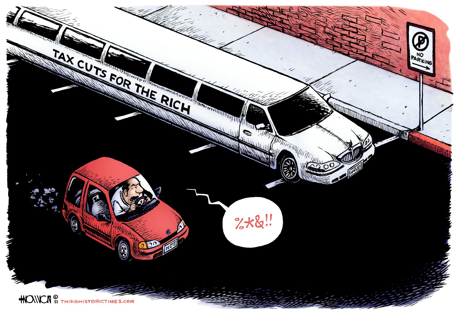
Long Cuts are Wrong

My initial idea for this cartoon involved a larger parking lot, with one row of spaces taken up by the absurdly long limousine seen above, and the other occupied by a giant tank or ATV representing the “defense” budget. While this certainly would have said more, I felt like it divided the cartoon’s attentions too much, and also didn’t seem to allow for the same compositional opportunities that this more focused version of the gag does.
I wasn’t sure whether or not it would be a good idea to include the “No Parking” sign. While I knew color wouldn’t be an issue online, I wanted to be able to reproduce the cartoon in black and white, if necessary, so I didn’t think the curb marked with red paint would be enough. As it is, I feel like the cartoon would probably still make its point without the sign, but the extra detail provides a good anchor point for the punchline in case of any doubt.
I was ill for the third time in as many weeks while working on this, so I finished it a day later than intended. Still, I have another idea I’d like to finish by the August 2nd “Debt Ceiling” deadline, if my health improves enough before then and I’m not too busy with anything else. Watch this space.


One Response to “Long Cuts are Wrong”
i get a 404 on the “whodunit” toon.
I think it is brilliant btw, very raw and pure truth.
Leave a Response