Reader Input
Hi folks,
So I thought it might be fun to involve readers in my ideas while they’re in development. In doing so in various places online in the past, I’ve found that it happens more than rarely that somebody will notice a detail or something in a sketch I’m developing, and they’ll have some valuable input on a way to improve it. It makes the whole development experience more interesting for me, since I get readers’ insight, and I think it makes it more interesting for readers because they get to participate. This is one of the major strengths of the web environment versus print, after all.
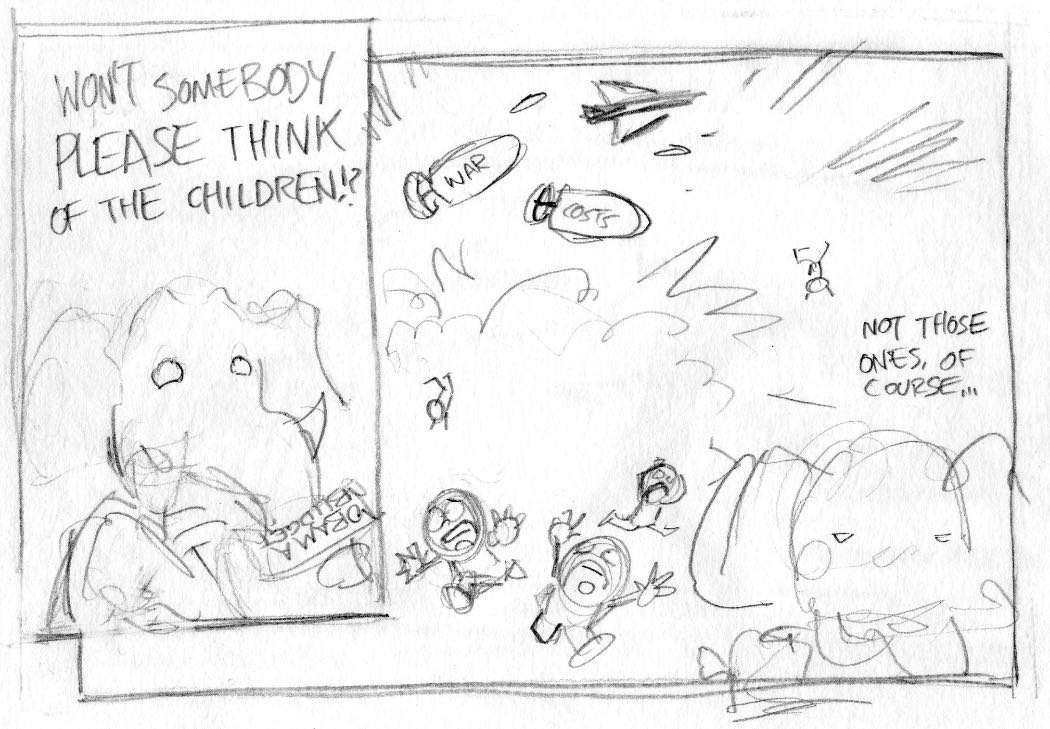
Anyway, I have two ideas for different approaches to the topic of Obama’s budget, which passed Congress the other day with no Republican support.
Here’s the first:

The piece of paper in the first panel reads “Obama Budget”, in case it’s illegible in the sketch.
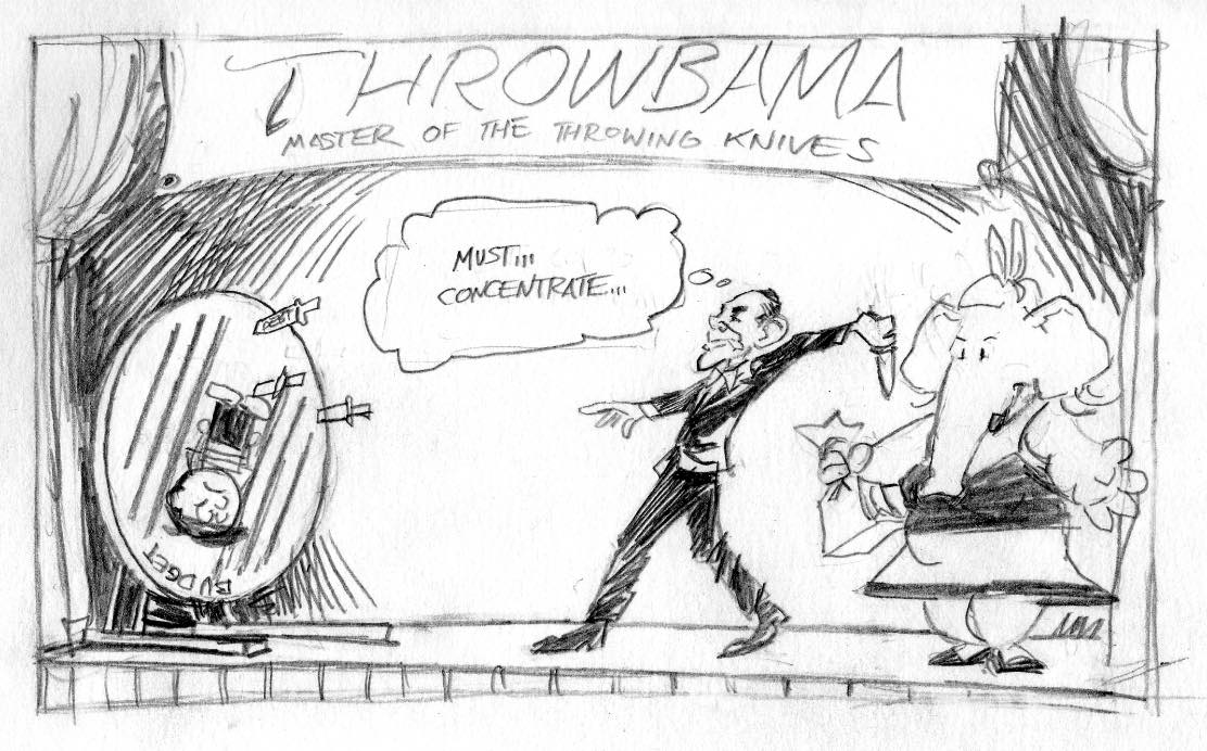
Here’s the second:

One of the knives is labeled “debt”, although it’s a bit hard to read here.
My gut instinct says to stick with the first idea, although I think I could find some better dialogue for the second panel. The gag is more direct and a little less convoluted. However, the main strength I see in the second is that it has some criticism of Obama as well as Republicans, in that his budget is something of a risky maneuver, which gives it a bit more depth and nuance than the first idea, in my mind.
What do you think? Post comments. I should have something new (either one of these, or something else) in perhaps a day or two, and depending on how this goes I may do it again with future cartoons.


7 Responses to “Reader Input”
Ok, here’s some unstructured reader-feedback:
Personally I like the second comic better, as it is more nuanced. I’m unsure of the use of a kid in the centre though. I know the GOP complains about putting the debt on future generations, but it’s sort of obscure (even for being a political cartoon…). In that case, the first comic is a lot more straightforward.
Did you consider using an eagle or something rather than a kid in the second one? It is after all not only something that touches the next generation, but also the US today. Also, for the second one I get associations to the Disney version of Robin Hood, where Robin tries to cleave the Sheriffs arrow, and the Sheriff knocks his bow away. Maybe its just the whole “Obama is a Robin Hood commie!” hype that’s talking.
I like the second one a lot better. Like the previous commenter said, it’s more subtle/nuanced, but I still feel like the basic joke comes across perfectly fine.
Also, I find “Throwbama” hilarious, for some reason.
What I don’t like about the second is that knives are associated with cutting, even if you’re emphasizing the pointiness of them here.
If this were a budget-cutting president, it would be perfect. It would reflect “how do you trim the fat from this budget without gutting essential services?”
Anything Obama is shown doing that puts a kid in danger of debt needs to be about growing/building/expanding something — e.g. rebuilding an edifice, but on a shaky foundation of debt.
What I don’t like about the first is there’s a confusing overlap. Actual bombs are falling on Iraqi kids, but war cost (what your bombs represent) falls on American kids — i.e., the same ones the Republican is supposedly worried about.
So he can’t say “not those children.” They’re the same ones. What if he just keeps yelling? Something like “those poor, poor children!”
Of course, that raises a question: Are you willing to represent Republican war debt as US planes bombing American children? Guess it depends how far you want to push the envelope.
It took me a minute or two to figure out what the elephant is doing in the second one. I’m not sure how that illustrates what’s happening in the budget discussions, though. How are the Republicans trying to scare Obama into making a bad budget?
I like the first one better. It’s more straightforward. (I don’t think nuance is really what you want in a political cartoon, anyway. By definition, a political cartoon is intended to make a statement, so you wouldn’t want to hide it.) It might be better if you can find a way to illustrate how a large part of the “Obama deficit” is actually the Bush deficit because those war costs were never included in the budget.
The problem with subtle nuanced comics is it’s very easy to make them a bit too subtle and have most viewers take something from them which you were probably not intending. For example, you describe the second one as though you’re trying to portray the budget as ambitious yet risky, yet the cartoon looks more like direct criticism.
Much of this isn’t your fault–political cartoons as a whole are getting more and more unsubtle these days, and any message other than “the target of this cartoon is BAD” is a rarity. In the current climate, the difference between the two cartoons comes across as “well, are you trying to criticize Obama for the budget, or the Republicans for not supporting it?” It’s hard to be clever. Still, it’s something to keep in mind and work around.
That being said, I’m tempted to say go with the first one, though the dialogue could use a bit of work to make the message (Republican objection to cost of budget to future generations while ignoring war costs) more clear. I can grasp it as it stands now, but it takes a bit of deciphering.
Sorry, doublepost because I’m illiterate.
I find the second one too wordy and oblique. The first one is stronger, but its two-panel layout is a little Mallard Fillmore though – I think your best work is usually done in only one frame.
Have you considered replacing the foreground in the second panel with the elephant’s dialogue/expression/prop in the first panel? I think the juxtaposition really speaks for itself.
I think Kjorteo’s criticisms above are pretty fair, but I’ve always enjoyed your work immensely. Good luck with the final draft. 🙂
Leave a Response